New Google mobile-friendly algorithm: what has changed in a month. Google mobile-friendly search engine algorithm Mobile friendly
The Google search engine has prepared another surprise for website owners - Google Mobile-Friendly an algorithm according to which sites with adaptive design will have higher priority in ranking (placed higher in search results), and will also be marked “For mobile devices” or “Mobile-friendly”. It is expected that this solution will allow the Google search engine to provide users with sites suitable for their mobile devices.
According to research from Google - more than 55% of users search engine make purchases using mobile devices. Therefore, owners of Russian online stores should pay attention to the segment of mobile devices; besides, in 2014 Google increased its share in search traffic from 26.9% to 32.1% and, due to the fact that it is a supplier of Android OS (the most popular mobile operating system in Russia), will probably continue to increase its advantage, especially considering Yandex’s not entirely successful experiments aimed at commercializing search results.
New algorithm Google Mobile Friendly will start working on April 21 in all languages. That is, from now on, sites without a good mobile version (not passing the Google Mobile Friendly Test) may not be shown in mobile Google search! So, for example, an online store that is currently shown in the TOP 10 of Google may immediately end up in the top 20-30, and site owners may lose up to half of their audience from Google search.
Example of a Google Mobile-Friendly site: http://demo.simpla-cms.ru
Therefore, we invite website owners and online stores to free consultation. We will check your site for compliance Google Mobile-Friendly Test and give recommendations for correcting errors.
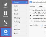
Checking the mobile version of a website for errors is a simple task. Responsibility lies with the search engine optimizer. The presence of an optimized version of the site is a ranking factor for site documents.
Mobile Website Tools
How to check the mobile version of the site.Check the site under mobile devices you can use the services:
- Google Mobile-Friendly
- Google PageSpeed Insights;
- WebPageTest;
- ScreenFly;
- WebPageTest;
- BrowserStack.
Mobile-Friendly
A service called Mobile-Friendly will show how optimized the site is for mobile devices and what errors there are in terms of optimization:PageSpeed Insights
You can also check the mobile version of the site for Google using a tool from the search engine Google systems which shows.The service is simply called PageSpeed Insights.
WebPage Test
It would be correct to check site loading for different devices and from different regions. You can check it using WebPage Test.The service is absolutely free.
ScreenFly
Using a special tool for mobile development, you can check how the site is displayed. The service is designed to view the site in the form in which the site will be displayed on mobile devices, but to solve the problem it is enough to use a browser.The tool is free.
Adobe Edge Inspect
If you have a fleet of devices to check the site, you can use the devices. The task of loading the site on all devices takes certain time, but the problem is solved.If you use a specially created one to open a website on different devices an application called Adobe Edge Inspect makes the task easier.
The tool is free.
The application is cross-platform.
BrowserStack
BrowserStack is a well-known service among website developers. The service shows the compatibility of the site on real devices.The tool is paid.
Bing Mobile Test
Check for free A site can be tested for compliance with mobile device requirements using the Mobile Test tool from the Bing search engine.Link to service -
Mobile is changing the world. Today, everyone has smartphones with them, constantly communicating and looking for information. In many countries, the number of smartphones has surpassed the number of personal computers; having a mobile-friendly website has become a critical part of having an online presence.
If you haven't made your website mobile-friendly, you should. The majority of users coming to your site are likely to be using a mobile device.
- If you don't know if your website is mobile-friendly, take the Mobile Friendly Test now.
- If you used content management software like Wordpress to build your website, check out our guide to customizing your website software.
- If you"re technical enough to do it yourself, check out our Mobile SEO Guide.
Why make a website mobile-friendly?
If not mobile-friendly, a site can be difficult to view and use on a mobile device. A non-mobile-friendly site requires users to pinch or zoom in order to read the content. Users find this a frustrating experience and are likely to abandon the site. Alternatively, the mobile-friendly version is readable and immediately usable.How much does it cost to build a site for mobile devices?
It varies. For example, here are some of the possibilities:
- Going mobile can be free if you can select a responsive template or theme for your website. A responsive template or theme adapts the display to the visitor no matter if they are using a desktop, tablet, or mobile phone.
- Going mobile can be free if you have the technical skills to build your mobile site. Check out Web Fundamentals.
- Going mobile will likely cost time and money if you need to hire a developer. Furthermore, if your website was created several years ago, a new developer might recommend starting from scratch (so you"ll be paying for a complete makeover). This is because there are new web development techniques and themes (or page templates) that may make it more efficient to re-do -- rather than modify -- your site. This is especially the case for sites:
- Built with Flash
- Using outdated e-commerce platforms
The good news is that if you start from scratch there may be an existing template or theme that you can utilize. You may be able to reuse your existing content which can hopefully save time and money.
I learned what will change for MF and non-MF sites, as well as how to become friendly towards smartphone users.
What is mobile friendly?
M.F. or "friendliness" site is the ability to adequately view the site on all devices from which users access it. The content of the page should be no wider than on the display.
Special attention will have to be paid to the text content - it is fundamentally important that the main points are placed on the page. Information on the screen should be placed in such a way that the user does not have to zoom or scroll horizontally. It is advisable to minimize the number of images with text. The site must not contain software for mobile devices that cannot be read by Googlebots (for example, Flash content).
It is important to place links at a sufficient distance from each other (Google recommends allocating at least 8 dp of space between links) so that it is convenient for users to click on them without “missing”.
The new algorithm is not so scary
“We learned that everything is much simpler than it seems,”- comments Natalya Voskoboynikova, content studio WordFactory
We bring to your attention the opinions of several experts interviewed by Natalya:

“The algorithm only affects individual pages, not sites as a whole. This means that, in general, the site’s position in the search results will not change. At most, they may miss out on some queries and pages.”
VaSily Voloshin, SEO specialist at Fresh IT Digital Agency
“According to information on Google's official Twitter for webmasters, mobile devices do not include tablets. Only smartphones are considered mobile devices,” - Oleg Gavrilyuk, head of the SEO department of Aveb company
So, fears about how a search engine will evaluate your site depending on how it looks on a smartphone, tablet, tablet, netbook, laptop are in vain.

“You need to analyze traffic and audience needs. For one service that has tens of thousands of pages of content in the search results, a separate mobile 3-pager, which is a quick application form, is suitable, for another (Online store) - just an adaptive design on Bitrix,”
- Alexey Slavgorodsky, leading SEO specialist, SEMatic
Thus, there is no urgent need to create a MF website for every company. First we analyze.
IN Google Analytics, Voloshin believes, you can see how many people visit your resource from mobile devices. To do this you need to go to Reports >> Audience >> Mobile >> Overview. If you only need graphs for free searches and free visits from mobile devices, select the segment “ Free search", and the segment "All sessions" is deleted. Then put a tick opposite "mobile" and press the button "Show on diagram"(next to the “Advanced parameter” button).

And, of course, intermediate results: the algorithm has been in effect for three months, but experts have not noticed any major changes in the Cyrillic output.
After "hour X", according to Oleg Gavrilyuk, no significant changes in ranking on mobile devices were noticed in Cyrillic search. There were isolated changes that were most likely related to other factors. The issuance in the US has changed more, but the dramatic changes promised in the press release are not observed.

On this moment There is no correlation between the “friendliness” of a site and its decline in search results. It doesn’t matter whether the site has a mobile version or not. Vasily Voloshin: “After the news from Google about this algorithm We have notified customers of the possible consequences. Some of our clients listened to Google’s recommendations and successfully implemented everything necessary changes, and some considered Mobile Friendly unnecessary for their business. We haven’t noticed any significant changes since the algorithm was released.” Sites with and without a mobile version still receive 10–15% of visitors from mobile devices.
So why make an MF website?
There are already changes in the issuance of burzhnet - if your resource is focused on the USA, Europe, you need to think about the mobile version now. Hypothetically, you risk losing some mobile traffic, if in the future the search results change in favor of MF sites and in the ru, ua zones.
The main thing is conversions
The number of smartphone users is growing, and accordingly, the number of purchases made from phones is also increasing. The more convenient your site is for customers, the more conversions.

Four ways to become mobile friendly:
- Adaptive design for various display sizes and types of gadgets. In this case, you are left with one address, the “weight” of the site will be the same as in the full version, and the design on the screen of mobile gadgets cannot be “turned off” (in the case of the mobile version, the user can switch to the standard version of the site).
- A separate existing version of the site, focused on mobile gadgets. At the same time, the functionality and style of a full-fledged website are preserved, but the pages will load faster (this is very important for mobile Internet users).
- RESS (Responsive Design + Server Side) will allow you to minimize traffic (you can remove unnecessary JavaScript from HTML, freeing up memory and cache on the gadget), and also produce layout for each device. The main disadvantage of this method is the complexity and high development costs.
- And another one good news: The MF version of the site is simple and relatively inexpensive even for small companies.
Are you mobile friendly? Exactly?
Judging by Google's statement in the official blog for webmasters, the change in the ranking algorithm, which SEOs dubbed Mobilegeddon, was supposed to change the search results on mobile devices. Sites adapted for mobile viewing should be given preference when ranking. Sites that pass the Mobile Friendly Test with a positive result are considered adapted.
The easiest way to check if everything is ok with the mobile friendly version of the site is to run the Mobile Friendly Test. More difficult is to analyze the effectiveness of the mobile version of the site in Google Analytics based on conversion or engagement indicators, - Oleg Gavrilyuk
This is what the test results for the site will look like:

What about mobile friendly texts?
Texts for the mobile version of the site are compact, well-structured pages. Essentially, these are landing pages. To create them, you will need an author with good copywriting skills who understands what infographics, visualizations are and how to make a page prototype. Ideally, such an author works in tandem with a designer.
There are only two most common mistakes when implementing a mobile version in terms of texts:
- When writing text under ready-made template pages. Then the question is not about correctly presenting a product or service, but about how to fit into the required number of characters for each block.
- Duplicate content. If two versions of the site are created with identical texts, the search engine may consider the mobile version a copy-paste
So, 10 facts worth knowing about Mobile friendly
- According to the official Google statistics, already in 10 countries around the world, mobile search has exceeded search from desktop devices.
- The Mobile Friendly algorithm will only affect search results on mobile gadgets. In other words, non-adapted sites may lose positions exclusively when viewed from smartphones.
- Websites will not be assessed as a whole, but page by page – Google will test for “friendliness” mobile gadgets every page of a web resource.
- The Mobile Friendly algorithm will not affect branded queries - when searching for a large restaurant or chain of stores on their phone, users will still end up on their official website.
- The algorithm produces clear results without additional gradations - your site will be recognized as either mobile friendly or non-mobile friendly.
- Resources that have not been tested and are not recognized as mobile friendly by Google are guaranteed to lower their rankings in search results. However, this has not yet been noticed in the Cyrillic output.
- Google identifies only three main indicators that influence a site’s “friendliness” for mobile devices: content, design, and page loading speed.
- Google recommends using responsive design as the optimal website optimization tool (you will get rid of redirects and will support only one version of the resource).
- Most of the changes Google recommends are related to the quality of the site on smartphone screens, and not to optimizing content or meta tags.
- Creation of a website with adaptive design for 3–5 typical pages costs only 30–50% more.
If you find an error, select a section of text and click Ctrl + Enter or use the link to let us know.
Search engines strive to improve search results users of mobile devices (smartphones, tablets), therefore sites optimized for different screen sizes will be displayed higher than sites without such optimization. This also includes mobile versions sites.
Signs of a mobile-friendly website:
- Easy to read content (readable without magnifying), large form fields and buttons.
- Lack of “heavy” pictures, Flash elements and unnecessary animation.
- Lack of Java applets and Silverlight plugins.
- No horizontal scroll bar.
- Minimum site loading speed.
- As simple as possible navigation.
- The viewport meta tag has been added.
Services for checking a site for "mobility"
To demonstrate how the services work, let’s take my website good partners- translation agency CONTEXT.
1. Google Mobile Friendly
You can check any site by simply entering its address in a line.
Displays on the screen what the site looks like on a smartphone and gives an overall assessment of its optimization for mobile devices.
Unlike other services, here you can check not every site, but only your own. That is, after the site is added to the webmaster’s interface with confirmation of rights to it.
The service displays the overall rating, checks 6 points of compliance and shows what the site looks like on a smartphone.

3. Bing Checker
General optimization plus compliance with 4 points is checked.
It also displays how the site looks on a smartphone screen (of course, on OS windows, while previous services displayed an Android smartphone =)).

4. Mobile Checker from W3C
The longest of all services. So “long” that I didn’t even wait for the check to finish =)
I waited for about 5 minutes, while other services handled it in 5-20 seconds.

5. Responsinator
Unlike the others, it does not give any ratings, but displays what your site looks like on 6 various devices in two orientations for IOS and Android, which is very cool.

UPD1: 07/20/2017:
6. Adaptivator
The service suggested in the comments to this article. I haven’t personally used it, but it seems to be pretty good. The capabilities are similar to the responder, but there is also an assessment of the result of adaptability.

UPD2: 3.11.2017:
7. iloveadaptive.ru
Another new service proposed in the comments. In my opinion, it is a little bulky and impractical, but this more than pays off with great capabilities. There is even sorting by OS.
Conclusion
Undoubtedly, adapting a website for mobile devices is not just a tribute to fashion and time, but a necessary attribute of a modern website that helps not only the end user.
Therefore, I recommend to anyone who wants to be closer to the client and have more visits/leads to adapt their websites as quickly as possible. Ask me a question -


