Parallax background effects when scrolling vertically. Favorite old games
In motion, parallax means a change in the location of an object against some background relative to an observer who is in place. This term has gained popularity on the Internet. In particular, a website with dynamic elements in its design looks interesting. Parallax is a way of designing a page on the Internet, used by webmasters to attract a large number of visitors.
What is parallax like?
Parallax scrolling can be used vertically as well as in a straight line. The best example is Nintendo. Many of us remember with nostalgia computer games represented by the movement of the main characters from the left side of the screen to the right. It is also possible to move downwards along a vertical straight line. often used on the web. To create a vertical slider, you can use JavaScript or CSS 3.
They are characterized by the described three-dimensional spatial effect. The game creators used several background layers. They differ in texture, while movement is carried out with at different speeds.
Don't think that parallax is only about creating a 3D effect. You can move existing icons on the page. Moreover, it looks quite attractive. A particularly good option is to use an individual trajectory for each of them. In this case, different icons are used, moving along different trajectories. This design attracts attention.
Picture coming to life
It's hard to find a site without images. High-quality and demonstrative drawings attract visitors. But the most attention is drawn to various kinds of dynamic images. Indeed, if there is movement when visiting a site, it attracts attention. The likelihood of a resource visitor returning to a dynamic image increases significantly. Did it seem like it was moving or not? Therefore, to attract visitors to the site, it is worth studying such a concept as the parallax effect.
Examples of sites with moving images:
- hvorostovsky.com;
- www.kagisointeractive.com.
As shown in the examples, the perception is improved by a menu that drops down into sub-items. This element saves time for visitors and is therefore attractive to them.
jQuery library
The term jQueryParallax defines the library of the same name. Thanks to it, it is easy to achieve the effect of movement in 3D format. In the jQuery library, a three-dimensional perception is created in various ways. One of them is to move background objects horizontally and simultaneously at different speeds. This library is characterized by the presence of a large number of different kinds of properties. And the displacement described here represents only a small part of its capabilities.
The site looks quite attractive, for the creation of which various modern elements. One of them is parallax. Example sites might look like this:
- www.grabandgo.pt;
- www.fishy.com.br;
- www.noleath.com;
- buysellwebsite.com.
jParallax is represented by layers that move with mouse movement. Dynamic elements are characterized by absolute ;). Each of them is characterized by its own size and movement at an individual speed. This can be text or an image (at the request of the resource creators).

Site visitor perception
After this, a person usually pays attention to the fact that the page is designed efficiently, conveniently and competently. This fact usually commands respect. Sometimes curiosity arises to try other elements. There are a huge number of identical sites on the Internet. How to make your resource special?
If you like the design, the visitor will stay for a longer period. Thus, the likelihood that he will be attracted by the posted information increases and he will show interest. As a result, the person will take advantage of the service, product or promotional offer offered.
Favorite old games
The concept of “parallax” should be familiar to all fans of consoles of the 80s and 90s. This applies to games:
- Mario Bros.
- Mortal Kombat.
- Streets of Rage.
- Moon Patrol.
- Turtles in Time.
That is, parallax is a technique that has been used for a fairly long period. These games are indeed remembered with some nostalgia. After all, they seem to be imbued with the character of that period.
The images on the screen are created using a technique called parallax scrolling. It is not surprising that this technique has gained well-deserved popularity. This design concept is quite warmly perceived by those who played in the 80-90s or watched their friends’ leisure time.

Parallax scrolling
Marketers of the world's leading brands have long been using various kinds of technical advances. Thus, it becomes possible to interest even a casual site visitor.
Parallax scrolling was used quite successfully by Nike. The company's original website was developed by designers Weiden and Kennedy. But this design was not preserved. The resource was gradually updated in accordance with modern trends. Activatedrinks.com is an example of a site whose design is reminiscent of the design used by Nike marketers from this period.

There shouldn't be too much dynamics
Do not forget that the design of the site is often the key criterion that guides the visitor. A poorly executed resource usually leaves the user with the impression that the owner company is not serious. But a website with various kinds of attractive design elements indicates the desire of the organization’s owners to interest visitors.
Here it is worth remembering about parallax. This is a wonderful tool. But even they shouldn’t get too carried away. Because the page on which there is large number various kinds of moving elements, quite difficult to understand. It is best to make the design moderately stylish and understandable.
Individual elements that require highlighting should be dynamic. There may also be a drawing that is created using layers moving one relative to another. Do not forget that a custom website is designed primarily for visitors. It should not be a masterpiece of a webmaster who has invested all his knowledge. After all, such an approach will only complicate perception.

How to create a movement on the site
How to make parallax? This question interests many website creators. It is not necessary to know the intricacies of writing tags. It is very convenient to use special resources on the Internet. From the large number of available proposals, the following assistants can be distinguished:
- Plax is a program that is quite easy to use. It tends to give the page movement by moving the mouse.
- jQuery Parallax Image Slider - jQuery plugin used to create image sliders.
- Jquery Image Parallax - suitable for designing transparent pictures. Through his use of PNG, GIFs gain depth while being brought to life by movement.
- Curtain.js is used to create a page equipped with fixed panels. In this case, the effect of opening the curtains is observed.
- Scrolling Parallax: A jQuery Plugin consists of creating a parallax effect when scrolling the mouse wheel.

Some more useful plugins
As you know, information has the greatest value. And the greater the number of ways to achieve what you want is known, the closer the probability of obtaining the right result. Useful plugins used to create dynamics:
- jQuery Scroll Path - used to place objects on a specified path.
- Scrollorama is a jQuery plugin. It is used as a tool for attractive design of the material. Thanks to convenient scrolling, it allows you to “revive” the text on the page.
- Scrolldeck is a jQuery plugin. It is an excellent solution used as a presentation for websites designed as one page.
- jParallax represents the movement of layers depending on the movement of the mouse pointer.
- Stellar.js is a plugin with which any element is designed with the addition of a parallax scrolling effect.

Parallax with cursor snapping
This parallax looks quite impressive. Objects on a site page that seem motionless at first glance move when approached. It seems to come to life and follow the element being moved.
First you should stop at the drawing. The required image is placed in a frame, and its edges must be hidden. The method is very simple, and the resulting drawing looks quite attractive.
The parallax effect for a website is a wonderful design method. Its use indicates that due care was given to the creation of the resource. Therefore, it is worth paying attention to the services offered or information to read. Such sites look more advantageous against the background of identical, but simply designed resources.
Every year we see different web design trends come and go. And sometimes it happens that a certain “trick” after some time begins to be widely used again.
In 2012, many foreign sites used a very interesting effect borrowed from games - parallax scrolling. This was generally the time of fashion for 3D, so they tried to make websites three-dimensional, multi-layered.
After a year or two, they somehow forgot about parallax, and those sites that were shining examples of its use went through a redesign, opting for other visual techniques. Today, this effect is experiencing a revival, and people are starting to talk about it again.
Let's remember what it is, where to use it and how, and also consider several striking examples of the use of parallax.
Parallax scrolling - what kind of beast is it?
The parallax effect on websites is very easy to recognize - it uses multiple backgrounds that appear to move at different speeds to create a sense of depth (creating an artificial 3D effect). This technique was widely used in “old style” games and is also an interesting trend in web design.
The term comes from the Greek "Parallaxis", which means "change". Today, this trend is re-making its way in the world of web design.
Parallax scrolling can be standard, vertical or horizontal, and with changing direction.
This is a very interesting design concept that looks amazing, but at the same time requires painstaking work. It is necessary not only to think through the implementation, but also to work hard on optimization - otherwise mobile devices or on big screens layers can slow down, and will not only decorate, but simply disfigure your creation.
When using parallax, try not to make one main mistake, which is often found on this kind of sites - the main layer is given a very high speed of movement, and as a result, the user cannot properly view the information or photo. I turned the wheel a little - and the photo or text had already gone far down, I tried to return it - everything was hidden up. Like, for example. At the optimization stage, pay attention to the scrolling speed of the layers; the main one should, ideally, move at the same speed as the scrollbar. But you can safely play with the rest of the elements that serve for decoration.
Where to apply?
Parallax scrolling looks great on sites with little content. This perfect solution for one-page, business card sites.
Let's say you only have brief information about the company, contacts and several photos. A simple website with such content will look boring and uninteresting. But if you add here unusual effects such as parallax, users will remember this resource for a long time!
It's actually very difficult to get people's attention these days. Many sites are full of flash effects, sound overlays, and other unusual features. Everyone tries to stand out as best they can - that's why designers began to return to parallax again.
This effect is also good for one-page pages that present a product or product line. Having thought through the concept, you can create something truly unique.
Some examples
Now let's move from theory to practice, and consider several sites that use parallax scrolling. Perhaps in this collection you will gain inspiration or find some original ideas.
Here is an original catalog of shoes, which, in addition to parallax, uses one more thing. Together, these techniques create a special atmosphere.
The page, as you can see, moves at the same speed, and geometric shapes- on the other hand, a little slower.

Here parallax again goes hand in hand with sound, and helps tell the whole story. In addition to the 3D effect, we see other fashion trends here - black and white colors designs, hand drawings, handwritten fonts. If you are too lazy to turn the wheel, turn on autoscrolling and enjoy.

Welcome to Milan! Plunge into the world of Italian art!
Here we see another unusual solution - to view the site you do not need to turn the wheel, but drag the content with the mouse button. Moreover, the page can stretch both to the sides and down.
You can also follow the list below, the site itself will show you the right place.

Could you present spare parts and other hardware in such an original way? This is an example of how parallax can help make a product website memorable and interesting, even if the product is very specific and intended for a narrow circle of people.

And here - interesting option restaurant website. There is little text content, and the designer found a brilliant solution - to combine it with bright photographs, which are located on a different layer and move at a different speed. Quite fresh and original.

Here we see wonderful 3D effects, which are created using video in the background, photos of different sizes, and even blurring of those elements that seem to be right “in front of the user’s nose.” And different speeds of movement of the layers, of course.

A striking example of a non-standard approach to parallax. A background that moves on its own combined with text that scrolls down; 3D models created on the right; changing background colors as you scroll - all this makes the site truly unforgettable.

With the emergence and widespread adoption of HTML5 (a new standard for structuring and presenting content on the World Wide Web) and CSS3 (an improved version of the description language appearance objects) it became possible to create more interesting and memorable design elements for all, without exception, Internet pages, including, of course, landing pages.
Parallax scrolling (from English parallax-scrolling - in web design: a special technique used primarily in computer graphics(when background images in perspective move slower than foreground elements) is one of the cutting-edge technologies of modern web design. But its excessive use can degrade the usability of the site and lead to a drop in conversion rates.
Today we have prepared for you a unique selection of parallax sites and advise you to get acquainted with examples of the most successful landing pages using this effect. Some of them look like works of art, others surprise with their extraordinary format, but all of them are worthy of your attention. Let's look at parallax and what it is with examples.
1. Flat design vs Realism
Which side are you on?
At the instigation of such giants as Microsoft, Google and Apple, (flat design) instantly became a hit of the season and the subject of discussion on hundreds of news feeds and blogs. It was perceived as some kind of breakthrough in the field of web design and, most likely, it actually was one. The interactive agency intact decided to draw the attention of its clients to this rather unusual stage in the development of virtual design and prepared an interactive journey, providing it with the title “Flat Design vs. Realism.” All this was created, of course, not without the help of the newfangled effect.
The creative director of the agency, Alejandro Lazos, explains that the most non-trivial thing was to combine an HTML5 game and parallax scrolling.
“We wanted all the action to happen continuously so that users could move from start to finish without stopping. To do this, we used ajax technology, which made it possible to transfer data via url and update the data in the background, providing the user with the relevant page without delay.”
2.Sony
 You have never seen anything like this before!
Probably no one in the world knows how to present their product the way Sony Corporation does. The presented landing page is part of Sony’s “Be Moved” campaign, about which they say the following:
“We were once called guinea pigs, because all the innovations that we introduce are immediately adopted by competing companies. They wanted to hurt us, but we took it as a compliment. Collaboration artists and engineers is always an experiment, but only in this case can you hope that tomorrow you will take a step forward.”
3. Costa Coffee
 The Graphite Digital agency chose illustrations that most clearly represent the company's products
This impressive one-pager is the brainchild of Brighton-based agency Graphite Digital. In the recent past, the agency was given the task of presenting the product of the Costa Coffee company in a bright and interesting way.
The result of the work deserves all praise. The landing page looks luxurious. It is filled with all sorts of interactive elements and animated illustrations.
4.Highway One
 The large weight of images turned out to be the main problem for developers
This stunning microsite, developed by Newcastle-based agency Shout Digital for luxury holiday and honeymoon travel agency Exsus, is another great example of the theme we're looking at. Their retro-style animation instantly grabs your attention and doesn't let go until the end credits.
Drive the classic 1959 Cadillac Eldorado and take you to all the famous spots along the California coast. At first glance, all the effects seem simple, but as soon as you start scrolling, the true magic will open before you.
5.Make Your Money Matter
 Manage your finances the way Make Your Money Matter suggests
The topic of money and personal finance is of interest to many, so the New York digital agency Firstborn chose an innovative format over a traditional one when preparing an order for a credit union.
Setting out to raise awareness of the target audience about the advantages of a credit union (and the disadvantages of banks), marketers created an amazing landing page that explained in an accessible and interesting way how a credit union works, where to find the organization’s offices and much more. In addition, there is a calculator that will calculate the profit that banks receive from your investments.
6. Cyclemon
 The landing page will show you everything existing species bicycles
Chinese sages say: “You are what you eat.” For designers and bike enthusiasts Romain Bourdieux and Thomas Pomarelle, the proverbial wisdom is “You are what you ride.” Their co-authored site will surprise you not only with its newfangled scrolling, but also with a wonderful sense of humor and first-class illustrations.
The developers, it seems, did not miss a single type of bicycle and tried to present them in such a way that every visitor would be eager to buy one and join the multimillion-dollar subculture.
7.Lexus
 You can test drive the car while staying at home in the comfort of your armchair
Thanks to this site you can try new model from the Lexus line without leaving home. The interactive video developed by the digital consulting agency Amaze will provide you with complete and very visual information on the interior and exterior of the Lexus IS. The effect of presence is guaranteed.
To achieve this result, the marketing team needed to capture the car against a variety of landscapes and scan the surrounding view at each key point. Thanks to HTML5 technology, the landing page functions on both computers and smartphones, making car promotion more successful than ever.
Wendy Stonefield, Chief Commercial Officer at Amaze, said: “Using HTML5 allowed us to achieve several goals. Firstly, this is a visual demonstration of the car, its functional features. Secondly, this is interactivity, which no modern project can do without: in this case, we allow users to choose the color of the car’s interior and exterior. When creating the video, we focused on the sophisticated viewer - and with the technologies that exist today, this has become more than possible. We showed the Lexus IS as it really is."
8. Life in my Shoes

Life in my Shoes (from English - through the eyes of another person) is an ambitious project, main task which is to eradicate fear and prejudice against HIV-infected people and increase awareness of the younger generation on HIV and AIDS. London-based agency Traffic was given the task of designing a landing page that could attract the attention of a young audience and gain their trust, and they did an excellent job.
The signature Houshka Rounded Medium font was implemented with support for the font-face syntax, making the page look livelier and more interesting. Other decorative elements along with the use of yellow color made the resource aesthetically pleasing.
9. The Beast
 The new landing page of the famous folk singer reads poetry and accompanies it with incredible images
To promote the new album of the famous folk singer Laura Marling “A Creature I Don't Know” (from English - an unfamiliar creation), the London digital agency Studio Juice developed an amazing landing page that reads poetry, accompanied by exquisite illustrations and expressive animations.
To create such a miracle, new semantic elements and attributes were used, thanks to which the animations are synchronized with soundtrack, and their speed corresponds to the previously specified parameters.
10. The Lab

Alzheimer's Research, the UK's leading institution dedicated to the study of Alzheimer's disease, has set out to communicate its work and its results in an engaging and accessible way. This is why The Lab resource was created.
On the page, each user has the opportunity to get acquainted with the laboratories and clinic of the institution, and pop-up tips in a laconic form explain what is shown on the screen. If you click on any of them, you will receive more detailed information. Showcasing how scientists bring their theories to life and give hope to millions of people is executed in the best possible way.
11. Why Your Brain Craves Infographics
 Infographics about infographics!
NeoMam Studios was noted for its wonderful parallax scrolling landing page, highlighting the main advantages of infographics as a method of presenting information.
“Parallax scrolling was the most difficult thing our developers had to implement,” shares Danny Ashton, director of the company. “They found all the available libraries to be banal, so they created their own instead.”
12.5emegauche

The main feature of this resource is that each page has its own scrolling mechanism. Each! This is a very fun and very successful approach, which also proves that this technology allows you to invent ingenious forms of presenting information.
13. Atlantis World's Fair
 The unusual scrolling here works not so much for entertainment, but for the plot
This online infographic was designed by Frank Chimero, who used parallax scrolling to not only present the information in a better way, but also to animate it and fit it into the context of a specific story. Aerobatics!
14. Every last drop
 Learn about the global problem of clean water shortage!
Animation studio Nice & Serious designed this landing page to draw public attention to the problem of clean water shortage on the planet. Where do we waste water? Where could we save it? How to do this? You will learn everything about this problem. Everything to the last drop.
15. Living Word

The digital agency Tribal was tasked with updating the online representation of the translation agency Living Word and making it informative and interesting. You can admire the result for yourself, but let’s say right away that the British didn’t come up with anything unusual, but did everything neatly and cleanly.
16. Madwell
 Parallax scrolling adds a bit of depth to Madwell agency landing page
New York-based business development agency Madwell uses a landing page to showcase its portfolio. Parallax scrolling is a certain highlight in the action they organized: the resulting 3D effect adds depth to their creation.
17. The Jacksonville Downtown Art Walk

The Jacksonville Downtown Art Walk is a traditional monthly celebration of culture and the arts in Jacksonville, Florida. The festival stretches over 15 blocks and features dozens of galleries, museums and bars. All this is accompanied by street actors and musicians. A beautiful website telling about this event can bring a joyful mood to your home.
18.Von Dutch

The fashion brand Von Dutch tells the amazing life story of its founder from the pages of its website. Undoubtedly, in order to be in trend, a newfangled type of scrolling was used for the site. As you scroll the page, pictures and icons float up and down, making it feel like someone poured water into your monitor while you were away.
19. Fannabee

Fanabee is a landing page created not only for those who are interested in music, but for those who collect it. With this service, you can post a list of what you've collected (CDs, posters, T-shirts, etc.) and find what you're missing.
20. Peugeot Hybrid4
 New technologies need to be presented in a new way, right?
The online comic, created by order of the automobile giant Peugeot, allows the company to perform two tasks at once: firstly, it quite effectively introduces the new Peugeot Hybrid4 mechanism to the attention of the target audience, and secondly, it works on the image of both the product and the company itself: joining Peugeot, which boldly experiments with formats and does not forget about its individuality, will now become even more prestigious.
21. Cultural Solutions

Cultural Solutions is a consulting agency that, as the name suggests, deals with issues in the field of art. The company logo is multi-colored circles superimposed on each other. That's why on home page site these circles are played out using the parallax effect. The circles move at different speeds, and this adds depth and volume. The result was a laconic, but very succinct and stylish statement.
22. jQuery Conference
 The developers of the jQuery Conference site do not forget about the main thing: they maintain the right balance between informativeness and effectiveness
The site, created specifically for the jQuery conference, is executed with imagination. As you scroll the page, jquery parallax scrolling triggers a chain of different animations: a bicycle passing from left to right, or a flock of seagulls chasing a shark. In general, it is original and not overloaded with effects: after all, the main thing is not only to surprise, but also to be heard.
23. Shape

The creative agency Shape on its landing page talks about the main stages of its activities in a fairly laconic form. Nice visual effects and animations add clarity.
24.Nintendo

To introduce the target public to the new Mario Kart series, the famous Japanese company developed a landing page that introduces the game in the format of a short journey through its world. The design of the landing page and its color scheme copy the style of the game, and along the way you will meet characters familiar from childhood.
25. Activate Drinks
 Just unscrew the cap and the action begins
Activate Drinks distributes vitamin-enriched drinks and has developed a resource that is up-to-date in every way to promote its products. First you unscrew the cap of the bottle (while scrolling the page, of course) and then find yourself in a whirlwind of fast-moving bubbles. Three levels of bubble placement create a 3D effect and the feeling that splashes will soon fly out of the monitor.
26. The Whitehouse's Iraq Timeline

Unusual scrolling is used not only to enhance the aesthetic side of the campaign, but also, in the case of the US government, in order to place semantic and emotional accents on the page. You may notice that all the content scrolls much faster than the images lying underneath. This was done specifically to keep the reader’s attention on these illustrations, which have an impact on the emotions of visitors.
27. Pitchfork Cover Stories

The famous music site Pitchfork loudly announced itself with the ambitious project “Cover Stories”. The online resource has acquired some features of a printed glossy magazine, but the use of the parallax effect for the website, interactive videos, interviews and unique photos made it unlike anything else. Animated portrait photos, soulful text and a perfectly chosen soundtrack - very eloquent and sophisticated.
28. Soleil Noir 2012 | We believe in…
 Captivating minimalism from the French from Soleil Noir
This fancy landing page, developed by the French from the Soleil Noir agency, is essentially New Year's card. Here you won’t find anything complicated: non-dizzying parallax scrolling, minimalism in illustrations, laconic phrases - but the simplicity is captivating.
29. Oakley
 Oakley combines stunning parallax scrolling with expressive photography
Oakley is a well-known supplier of safety glasses and masks, and this resource is designed specifically to promote the new Airbrake MX safety glasses. The landing page combines stunning parallax scrolling and expressive photos that perfectly present the product.
30. Jason Kenny OBE
 Landing page of three-time Olympic and two-time world cycling champion Jason Kenny
Earlier this year, Bristol marketing agency Fiasco Design designed this amazing landing page for three-time Olympic and two-time world cycling champion Jason Kenny. Agency co-founder Ben Steers states: “Based on the technical specifications, we decided to create a one-page website with vertical scrolling and parallax.”
31. La Moulade
 The navigation bar allows you to quickly and easily move to the desired area of the page
Among the growing number of landing pages that use scrollbar position to trigger animations and sound effects, the creation of the French agency La Moulade stands out with a very unusual indicator of your position on the page. It is located at the top and also gives you access to any part of the site.
32. Walking Dead
 The most difficult thing is to combine the achievements of all technologies together
“First of all, we are fans of this show,” lead designer Gavin Beck shares his impressions of working on the project. “Our plan was to create a website that fits the world of The Walking Dead, which fans of the series would appreciate and explore. To achieve our goals, we used new developments such as HTML5, CSS3, JavaScript/jQuery, Web Audio/HTML5 Audio and, of course, parallax scrolling. The biggest challenge was getting all these technologies to work together and be available on all kinds of platforms."
33. New York Times: Tomato Can Blues
 Could this be the future of online journalism?
In an era when people do not bother reading newspapers and magazines, many journalists are wondering how to attract the attention of the audience to the printed word. One of the options for overcoming the crisis was proposed by the American newspaper The New York Times, which developed a new form of presenting magazine articles and stories - a one-page website created using the latest developments in the field of web design and decorated with illustrations by Attila Futaki.
As soon as you start scrolling the page, the illustrations will move and immerse you in the action being described.
34. Health Service Payouts
 Nothing complicated, it would seem, but it looks quite entertaining
Regardless of whether the health care institution is budgetary or private, the leaders of these organizations are increasingly concerned about the growing volume of compensation payments. The presented infographic reveals exactly this problem, but attracts attention with parallax.
As soon as you start scrolling down the landing page, the screen will show a healthcare worker walking down the hallway pushing a gurney in front of him. It moves from section to section, each representing a specific year in the history of the UK's National Health System. The pop-ups contain information about what maximum compensation payments were made during those years. Nothing complicated, it would seem, but it looks quite entertaining.
An employee of the agency that developed this landing page shares his impressions of the work: “To create this site, we used new technologies in HTML5, CSS3 and JavaScript. Since animations are a key element, we mainly used the “skrollr” animation libraries. We drew each element by hand and added the finishing touches using CSS3.”
35. We are Unfolded
 Perfect game different types scrolling
This resource was created by the Norwegian agency Unfold and is an example of a combination of effects such as infinite scrolling and parallax scrolling. The navigation bar, hidden in the upper right corner, will always let you know where you are on the site and will allow you to quickly move to the area of interest to you, and if you scroll to the end of the site, you will notice that the scroll bar slider will automatically move up and you will continue to scroll the site again, from the very beginning.
36. Savings Challenge

To create this landing page, the developers used the skrollr.js plugin, which allows visitors to “scroll” events on the page. This made it possible to achieve high modeling speed, providing more time to smooth transitions and build an effective user interface. CSS 3D technology was used to create animations.
Stellar.js plugin
Stellar.js is a plugin that allows you to apply a parallax effect to any scrollable object. Although this plugin is no longer supported, it is used by many developers due to its stability and compatibility with latest versions jQuery.
Another useful feature is the ability to work without jQuery libraries. Therefore, landing pages created on its basis weigh less and load faster.
Conclusion
The world does not stand still, and new works of art in the field of web design appear every day. Will you be among these heroes? It’s easy if you adopt these wonderful technologies. But don’t forget about the main thing: any implemented effect should help increase conversion! Otherwise you simply don't need it.
The LPgenerator platform, or more precisely, our visual editor, supports parallax effects; See for yourself using the templates in the LP Store landing page store

This article shows how to using CSS transformations and manipulations with 3D to create a parallax effect on the site using pure CSS.
Parallax is almost always created using JavaScript and, most often, turns out to be resource-intensive, due to attaching listeners to the scroll event, directly modifying the DOM, and triggering unnecessary redraws and rearrangements. All this happens asynchronously with the thread in which the browser renders the page, which is why the scrolling begins to slow down and the picture is torn to pieces. Better parallax implementations track scrolling and use lazy DOM updates using requestAnimationFrame . The result is a qualitatively different one, but why not get rid of JavaScript altogether?
Moving the parallax effect to CSS saves you from performance problems and unnecessary manipulations, allowing the browser to regulate everything itself using hardware acceleration. As a result, almost all resource-intensive processes are handled directly by the browser engine. The frame rate (FPS) remains stable and the picture becomes smooth. Plus, you can immediately combine parallax with other CSS features - media queries or supports. Responsive parallax - what is it?
Theory
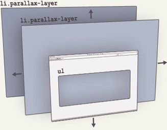
Before we dive into understanding how this mechanism works, let’s create the necessary markup:
And basic styles:
Parallax ( perspective: 1px; height: 100vh; overflow-x: hidden; overflow-y: auto; ) .parallax__layer ( position: absolute; top: 0; right: 0; bottom: 0; left: 0; ) .parallax__layer- -base ( transform: translateZ(0); ) .parallax__layer--back ( transform: translateZ(-1px); )
All the magic happens in the parallax class. Defining the height and perspective style properties will set the element's perspective to its center, creating a fixed 3D viewport. overflow-y: auto will allow the content inside the element to scroll normally, while the element's descendants will be drawn relative to a fixed perspective. This is the key to creating the parallax effect.
Next, the parallax__layer class. As the name suggests, it defines the content layer to which the parallax effect will be applied. An element with this class is pulled out of the general flow of content and positioned to fill its container.
Finally, we have the parallax__layer--base and parallax__layer--back modifier classes. They are needed to regulate the scrolling speed of parallax elements, shifting them along the Z axis (removing them or bringing them closer to the viewport). For brevity's sake, I've only made two scroll speeds - we'll add a few more later.
Depth correction
Since the parallax effect is created by 3D transformations, moving an element along the Z axis has the side effect of changing the size of the element depending on whether it is closer or further to the viewport. To fix this, we need to apply a scale() transformation so that the element is drawn at its original size:Parallax__layer--back ( transform: translateZ(-1px) scale(2); )
The scaling coefficient can be calculated using the formula 1 + (translateZ * -1) / perspective) . For example, if the viewport's perspective is set to 1px and we offset the element by -2px on the Z axis, then the factor will be scale(3) .
Parallax__layer--deep ( transform: translateZ(-2px) scale(3); )
Layer speed control
Layer speed is controlled by a combination of perspective and Z offset values. Elements with negative Z values will scroll slower than elements with positive Z values. The greater the difference between the value and 0, the more pronounced the parallax effect.(i.e. translateZ(-10px) will scroll slower than translateZ(-1px)).
Creating different areas of the parallax effect
The previous examples demonstrated the basic technique of using simple content, but most parallax sites divide the page into different sections with different effects. Here's how we can implement this in our method.First, we need a parallax__group element to group our layers together:
the CSS for it would look like this:
Parallax__group ( position: relative; height: 100vh; transform-style: preserve-3d; )
In this example, I want each group to fill the viewport, so I specify height: 100vh , although the number for each group can be different if needed. transform-style: preserve-3d prevents the browser from flattening parallax__layer elements, and position: relative allows child parallax__layer elements to be positioned relative to their group.
An important rule to remember is that when grouping elements, we cannot trim the content inside the group, as overflow: hidden on the parallax__group element will break the entire parallax effect. Uncut content will result in child elements will go beyond the limits. Therefore, you need to play around with the z-index value of the group to be sure that the content will be hidden and shown correctly as the user scrolls the site.
There are no hard or fast rules when it comes to working with layers, and different methods require different implementations. But to simplify debugging the positioning of layers, you can apply a simple transformation of group elements:
Parallax__group ( transform: translate3d(700px, 0, -800px) rotateY(30deg); )
Take a look at the following example and notice the debug checkbox!
Parallax(Parallax, Greek. change, alternation) is a change in the apparent position of an object in relation to a distant background depending on the location of the observer. This term was primarily used for natural phenomena, in astronomy and geodesy. For example, this displacement of the sun relative to the pillar when reflected in water is parallax in nature.
In web design, the parallax effect or parallax scrolling is a special technique where the background image in perspective moves slower than the foreground elements. This technology is being used more and more often, as it looks really impressive and cool.
This effect of three-dimensional space is achieved using several layers, which are superimposed on each other and move at different speeds when scrolled. Using this technology, you can not only create an artificial three-dimensional effect, you can apply it to icons, images and other page elements.
Disadvantages of the parallax effect
The main disadvantage of parallax- these are problems with site performance. Everything looks beautiful and stylish, but the use of javascript / jQuery, with the help of which the parallax effect is created, greatly weighs down the page and greatly reduces its loading speed. This is because it is based on complex calculations: javascript has to control the position of each pixel on the screen. In some cases, the situation is further complicated by problems with cross-browser and cross-platform compatibility. Many developers recommend using the parallax effect on a maximum of two page elements.
Alternative solution
With the advent of CSS 3, the task has become a little easier. With its help, you can create a very similar effect, which will be much more economical in terms of resource consumption. The bottom line is that the site's content is placed on one page, and movement through subpages occurs using the CSS 3-transition method. This is the same parallax, but with some difference: the fact is that it is impossible to achieve movement at different speeds using only CSS 3. Besides, this standard Not supported by all modern browsers. Therefore, there are difficulties here too.
Conclusion
Although the parallax effect is popular, not everyone is in a hurry to use it when creating a website due to the problems mentioned above. Apparently, it just takes time for technology to overcome the difficulties that have arisen. In the meantime, this option can be used on one-page sites: this way it will definitely be remembered and will be able to retain the user.
Parallax in javascript
- jQuery-parallax scrolling effect - a plugin that binds the parallax effect to the movement of the mouse wheel
- Scrolldeck- plugin for creating parallax effect
- jParallax- turns page elements into absolutely positioned layers that move according to the mouse